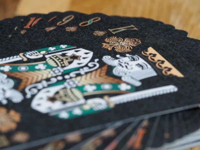
In the next article in my series about how board games go from an idea to a product, I want to talk about the creative people who are responsible for the graphics and other visual bits that we see when we play games. Very often their work is what we see first and remember vividly afterwards, but very rarely do we remember their names. If done well, the visual elements of a game blend seamlessly and add to the experience but don't detract from the gameplay.
I appreciate that the visual appeal of a game will be of different importance to different people. I'm a very visual person, so illustrations and artwork are very important to me. So it's sad that I can't name more board game illustrators whose work I have admired in the past. Even with games like Wingspan, where the illustrations of the birds are anatomically perfect and were all done by hand, I find it hard to remember the names of the artists who created them*.
Even if you do remember their names, you probably forget that a third artist** was responsible for all the other graphic elements in the game, like the player mat, round end scoring tokens, food icons and other graphic design decisions.
I think the problem is that we find it hard to appreciate how much work goes into creating the visual elements of a game. We only really notice it when the outcome isn't brilliant. Of course, whether artwork is good or bad is mostly a matter of taste, but there are times when it is clear when illustrations were rushed.
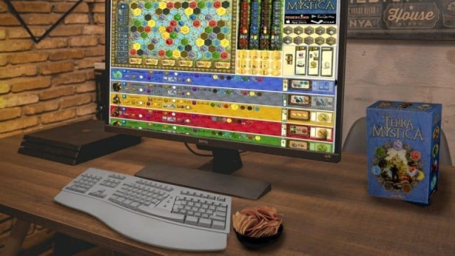
It may not be so obvious with artwork, but I think most people can easily tell when the graphic design in a game wasn't done well. A badly laid out player mat with confusing icons can make a game almost unplayable - or at least will require a lot of referring back to the rulebook.
Artwork can have the same problem though. If the chosen colour palette makes it hard to see where on a game board things need to go or what different action spaces mean, then even the most beautiful illustrations and drawings don't help the game.
Yet, many of us really admire gorgeous artwork. It's not uncommon for people to frame the board and components of a game, because they are just so very pleasing to look at. Box cover artwork is similarly important and if done well, it really pulls you into the game.
In fact, for many of us, wonderful artwork can take us into another world - the world that the game lives in. Beautiful illustrations can, as the saying goes, replace a thousand words - if not more. We can imagine whole adventures just by looking at a single picture. Artwork can evoke deep emotions.
Different games will require different artwork to work well and the style will also change depending on the target audience. The classic example being that bright colours and cartoon characters will be more appealing to a younger audience, while highly detailed and almost realistic drawings are probably aimed at a more mature audience.
The subject matter portrayed in a game's artwork is also important. It needs to be in line with what the game is about. It can represent the type of mechanisms that a game contains for example, or it can be more about the setting of a game or the story it tries to tell.
Again, it is important that whatever the message a game is trying to convey is, the artwork translates it clearly and in an easy to understand way. Mind you, board games often contain little Easter eggs in their artwork. So it is also possible to hide messages in the drawings and illustrations.
What we don't want though is artwork that intentionally tries to marginalize or misrepresent people. The days of drawings showing female characters wearing completely impractical armour should be behind us, even though I know they're not.
Graphic design's role is a bit different to artwork though. It is about being able to convey information quickly and concisely. Great use of icons and other small graphics, as well as appropriate white space and the right colour palette will make it easier for us to absorb a lot of information in a short time.
In fact, I have been skirting around the visual accessibility of games for now. Of course, for blind, visually impaired or colour blind people, good graphic design is very important. If elements are too small or if the wrong colour palette is chosen, then a game can become very difficult or even impossible to access for those people without help.
Artwork is often of very little important for blind and visually impaired people, whose focus is on readability and visual clarity, rather than highly detailed drawings.
There is a lot more to consider of course, but I hope I have shown you some examples of how important the visual artists are for board games. I have not touched on sculptors or photographers yet, but hope to be able to do this in a future article.
If you're a graphic artist in the board game industry, please share your experiences and let me know if I have missed important parts of your role in our hobby. I'd love to see them in the comments below.
*In case you were wondering, the names of the artists who created the bird drawings are Ana Maria Martinez Jaramillo and Natalia Rojas.
**Beth Sobel was responsible for all the other graphic elements in Wingspan.
 Games
Games How to resolve AdBlock issue?
