 There are a lot of things that go into making a memorable board game, and we here at F:AT spend a lot of time talking about things like Theme and Mechanics, but the look and feel of a game can often contribute greatly to the overall experience of playing a game. With certain games, the artwork almost makes the game. I don't much care for Carcassonne, but I must admit that the little cartoon-like cities were part of what attracted me to the game when i bought it, and are what get people like my wife and in-laws to play it.
So I went out to try and get some perspective on what it is like to develop the artwork that goes into the games we all love to play. I was able to get Mike Doyle, to respond to my emails and what follows is a conversation I have with him overs several days.
Malloc: Lets get started by going over a bit of your personal history. How did you get interested in art and graphic design?
Mike Doyle: Well, I’ve been interested in art as long as I can remember. Certainly around 4 or 5 I was drawing like crazy. My parents tell me even then I was hoping to be an artist when I grew up. In second grade I remember there was a poster sale at school. Most of the kids bought fun posters. I got a bunch of old master Dutch still life posters. That's where my heads always been. Eventually, my parents paid for oil painting lessons when I was around 16 or so and I got into that pretty seriously for time.
Malloc: How about Board Games, were they something you played as a kid or was your introduction to them later?
Mike Doyle: The same goes for boardgaming. I can’t remember not loving games. Growing up, I played as much as my sister and neighborhood friend would tolerate. I loved all the typical stuff, including Masterpiece –for obvious reasons. In junior high and high school my youth pastor got a group of us into Risk, Acquire and
Diplomacy. He also loved wargames and had things like Panzer Leader, Blitzkrieg and other AH titles which I played a few times. So, I began visiting the shops (this was in the early ‘80s) and picked up a couple of random titles like Arab Isreali Wars, Conquistador, Civilization, War and Peace and such. By the time I got in college though, I had dropped the games and found computer and Nintendo titles. I didn’t pick up boardgames again until years later (perhaps around 2000). A few years earlier in ‘95, I remember visiting the Complete Strategist
(a nice boardgame store in NYC) after moving in the area for a job. This was the first time in a decade that I had gone to a boardgame store. I bought a few titles including Republic of Rome, but didn’t have anyone to play with. There were probably Euros there as well, but I must have passed them up in favor of
my old familiar brand Avalon Hill. I had always loved the orderly way their games sat in the shelves. My wife and her family liked games so around 2000 we got into that through a R&R game called Sold!. I began looking for more like it and found Settlers and then followed the usual addictive path to the state I’m currently in.
Malloc: What about education, did you study art in school, and had you planned on making a living with you artistic abilities from the beginning?
Mike Doyle: In terms of my professional career, I graduated from Pasadena Art Center College of Design majoring in Graphic Design and Packaging. From there, I went straight to the branding agency in NYC where I have been for 14 or so years. I’m a design director here and have a staff of talented designers that work on
branding and packaging initiatives of all types and sizes. Some are large and mass oriented like recreating the packaging for Pepsi cans/bottles worldwide earlier this year or the identity for the power company of NYC (Con Edison). Other projects are smaller and more upscale like a full identity and packaging program of a high end cigar for Davidoff called Zino Platinum. Currently, we are creating a new identity, wayfinding and full program for Fontainebleau hotel in Miami, which will be an upscale affair. All are fun in their own ways and require focus toward getting a proper aesthetic and read to the right people in order create appeal and drive sales.
Malloc: It is often said that artists, be they visual, musical or literary, view their medium differently than those who do not practice that profession, when playing games does the artwork affect you in anyway? Will a bad art design ruin an otherwise good game for you? Name some examples of games where exceptional artwork has helped the game. what about games that you think the artwork gets in the way of things.
Mike Doyle: On one hand, I am pretty critical of boards as I can see what could be done to improve. On the other hand, I’m pretty forgiving as I understand what it takes to get it done –which is a lot. Critiquing what is done is much easier than creating it in the first place. I don’t know if art has ruined the experience ever. For excellent design, I look for things of beauty that inspire and awe as I look at it. If I can play the game fine with it, then that works for me. Recently, Pillars of the Earth and Taluva have drawn me in because of the artwork – especially Taluva.
The old Medici is one of the poorest examples of graphic design that I can think of as it really gets in the way of playing and it doesn’t look good at all – a double whammy. We still have lot’s of fun playing it, but the design causes quite a bit of stumbling and confusion.
Malloc: I believe the first work I noticed of yours was your PR redo (thanks BTW I made a copy and that was my first attempt at making boards and counters, something I do now a fair bit) what inspired you to start redesigning games and updating artwork? did this lead into professional design, or were you doing that anyway? Also any chance of you finishing that redo of Dune?
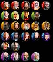 Mike Doyle: I think it was a natural thing for me. I love to design and I love gaming. I love information design as well. Charts and graphs are quite fun for me to do – the “Tufte way”. Games are part information, part experiential or atmospheric and part branding. I’m very drawn to this combination. I think the goal from the beginning has been to work for publishers though I continue to create my own pieces as well. Dune is one of my most requested “could you finish this please?” pieces. Perhaps I will as it was great fun to do and I like the look
of the leader tiles. Though I would do something a little different with the
board, I think.
Malloc: When designing for a game, is there a technique you use when getting started, or is each project a new process? What would you say are elements that you include as a Mike Doyle fingerprint? What other game artists are your favorites and what do you tend to like about each of them?
Mike Doyle: I don’t know if there is a technique. Each situation is unique. However, the more games I design, the more challenging it gets as I want to do something different than before. I usually start by visually researching an era or event and styles of illustrations that I can mimic. Also, knowing the weight of the game and how strong the theme matches the actions can help. Many times it starts with an idea. For Caylus, I wanted to have the principle goal of the game – building a castle – to be in the center of the game with the hustle and bustle
of activity around it. For Tigris and Euphrates I had wanted to replace the map (which was just for atmosphere) with something that felt as if the game might have been played thousands of years before.
In terms of a fingerprint, I think the thing that I look to is to make the game different and stand out in some way. Whether it be the cover or the board, I look for opportunities to separate the game and give it an iconic presence. Just as gamers are put off by games that play “samey”, so too a samey look can bore or communicate, “just another one of these”. Additionally, for covers I much prefer them if they look like they are for an adult –they need a level of sophistication. I don’t see this being done at all in the industry and is a big
opportunity to upscale the market and redefine the game. Just as game designers have redefined what a game is, so too should the package communicate that this is something different. Geeky preconceptions need dispelling.
I also am fascinated with game boards that look like games. For instance, with El Capitan, no effort was made to make the board look like land masses, water and buildings. Instead, I went with areas that look mini wood playing boards sitting on crumpled cloth. Another approach could have been made like Pillars of the Earth or Cuba, where you have a "realistic" portrayal of the situation. Nothing wrong with that approach, but my inclination is to do something a little different here and have things sitting on things which feels like a
physical game somehow.
I very much like a rich look to my games as well. Very often (particularly with Euros) theme is but ambiance. That’s not a bad thing –it just is. Medieval this, reniassance that. It’s all fine because it feels good. So too, a board should contribute to that rich atmosphere that we take in when playing. After all, you are more likely to spend time staring at a board than that pretty picture that has been hanging in your house for years. Eye candy and beautiful bits are a big part of the experience. Games should tickle our brains and caress our eyes.
Michael Menzel is my favorite artist. Pillars of the Earth, Thurn and Taxis, Cuba, Jambo and Thief of Bagdad are a few of his. He’s very talented. I always enjoy his boards as they have that richness that I look for. They play just fine and provide me with something that can transform the experience from a collection of rulesets into something I can gaze at and even take pride in as I share my hobby with others.
Malloc: On your blog, http://mdoyle.blogspot.com/, you focus on the role of game art in invoking the theme in eurogames. You mention how in these game you think more about mechanics then the actual theme of the game. Please talk about how this provides a certain level of freedom for the artist to evoke the mood for a particular game.
Mike Doyle: I strongly believe that theme in Eurogames is, for the most part, simply ambience. It makes us feel good when playing. This as opposed to a nonthemed abstract which has little ambience aside from the bits or a Ameri- or Wargame where ambience is woven tighter into the play itself. Sometimes it is clear a Euro has been crafted from the get-go to act out a certain event. Tempest and T&E are two such games for me, though the Euro dictate of simple rules smoothes out thematic immersion. Most of the time though theme is pure flavor. This is not to diminish these games at all as the flavor is a huge part of the experience and Euros are trying to accomplish something else with their play. Given that most Euros are not trying to recreate events but use them as flavor, it is not imperative that the artist recreate the event with such specificity.
For example, in Caylus Premium Edition, I chose to make the tiles little images that appear as if from an illuminated manuscript (all relating to each respective building). A few remarked that it makes no sense to put a worker on a chicken! The thing is, when playing the original Caylus, I don’t feel a castle being built or workers moving to a farm or to a tailor and I don't feel the activity of picking up goods needed to build the castle. What I feel is a lot of tense play working to get –pleeeese lord let me get –that one more pink cube or whatever it may be. I also feel "medievalness." Picturing a building on a tile will do absolutely nothing to immerse me into the meaning behind that action. The play and mechanics are simply too abstract for that. My brain understands it, but my heart does not feel it when playing. Additionally, after awhile all those buildings start looking alike and bore. However, by expanding on the medieval language of illuminated manuscripts, I can provide a lovely atmosphere that is unique and iconic –it is the mood, not the individual specificity of the activities themselves.
In the same way, I find many Euro covers get caught up in this manner by getting overly involved in actions implied by little wooden cubes and a couple tiles. When playing, do I really get the feeling of the hustle and bustle of a port with merchants and ships unloading and loading in Hansa? Is this supposed to fill the gap between the theme and those disks or the ship with the highly programmed movement? In the end, it can be a little let down that the game is not the picture at all. Don’t get me wrong, I love the game. But it is not trying to deliver an account or recreation of shipping in this era –just a general mood of it as ambience (much like lighting and background music might do in a restaurant). What I want from the cover is something that promotes the mood that I can expect from the game or theme and hopefully something that satisfies me as a “sophisticated” adult (read: it does not look geeky but has a bit of style to it). Unfortunately, the general dictate is to recreate the event
and implied actions with less than sophisticated imagery. Consequently, the packaging is a bit embarrassing.
Malloc: When designing for games with more integrated themes, Ameritrash or Wargames for example, what do you think the role of the art design is? How are the challenges in designing these types of games different than the challenges present when designing euros.
Mike Doyle: I think, in the end, it is the same role or "has the same functions". I believe the function of art in all boardgames is four fold:
1. Information design - clarity and comprehension
2. Aesthetic needs - attraction and ambience
3. Thematic needs - enhancing the story
4. Branding - the creation of a unique look for a branded property (not "samey" looking)
All these functions need to have the right balance according to the game. Ameri- and (particularly) war games, generally have more information that a player needs to access. So the balance can shift to more charts or the clear display of complicated information. Even so, charts can look beautiful with proper typesetting. In terms of dealing with theme, in games that provide richer, deeper play, it can be more appropriate to have thematic detailing be more direct and literal than more abstract games (like Euros).
What I look for in a final product is a game that catches the eye, looks really fun to play and plays well. Many who post on various forums get overly fixated and hung up on informational detailing, pronouncing "art getting in the way of play" when a detail does not reach their impression of the highest level of readability. Sometimes this can be true but most of the time such individuals are really missing the point. Games (and Euros in particular) are mood based. Yes, a scripty font might be harder to read in some cases. But does it detract much in the play or add more by virtue of mood? In some cases, the add to mood is too costly an informational sacrifice (like
Indonesia and Medici). In others, yes a board may not read quite as well, but it works just fine and adds greatly to the mood. The hallmark of good design here is recognizing the value of the contributions and merit of all elements and to what extent to the various functions (not just informational) they add.
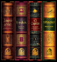
Malloc: I personally like the work you are doing with QWG's Masterprint series box redesigns, the overall feel reminds me a lot of the 3M bookshelf games, what was your inspiration in making these, what were you trying to accomplish by changing the box art, and why were they limited to this and not a total redesign?
Mike Doyle: Thanks very much! For QWG's Masterprint series we set out to create a strong branded look that could have great appeal. Old books seemed a nice idea that is warm and inviting and allows gamers to accessorize their house with games. I really hate the fact that boardgame boxes are such that they need to be relegated to the closet. I would much rather have a set of games that look so good, they can be displayed with pride on the coffee table or fireplace mantle. Game boxes should be beautiful enough to displace the coffee table books and
reach places of status in gamers' homes.
We live in a world now where it is relatively easy to access foreign titles. They'll be more expensive with the shipping, but they're often easily gotten. Additionally, with Euro titles, language independent components are more common then they used to be. For those titles whose rules are available online, it almost becomes a matter of style. Publishers can style their products/boxes to attract outside of their market on the basis of this. If your market has a style you like, that's great. If something looks really nice outside your market for a title that you really care about, there is an alternative. In the case of QWG's MP series, the print run is very small with them, so each one is a bit rare which can be a draw as well.
These have been compared to the 3M series a few times. I don't think we ever thought of it this way, though I was raised on the old AH titles which always impressed me from a set point of view.
As for why not restyle the entire game, that is only a cost issue. The cost of art and design would factor in. Also, for language independent boards and cards, costs can be reduced significantly to have all the publishers run them
simultaneously in one print run. For the limited Dutch market, it would not make any sense to redo an entire game, I'm afraid.
Malloc: What about new games like Supernova and Container, was it easier to work on these project since there were no preconceptions as to the look and feel? Is this more or less rewarding as a professional than working on a title that may be more constraining like Hannibal or Titan?
Mike Doyle: Here I’ll speak generally on new verses rereleased games. For new games, the information design and ordering of the elements on the board, cards, etc are brand new. So everything needs to be thought out from scratch. For the information design on games already released, one only needs to look at what is working or not or could be improved on from what exists. So this is much easier as some of this research has already been conducted. Additionally, for the rereleases, I look for opportunities to make the board look better than before so that it can generate a lot of appeal and be considered a worthy upgrade for some. The constraints are that a certain level of continuity needs to be maintained so that one used to the old, can adjust to the new. For example on Titan, certain icons were maintained as well as the basic geometry of the board.
In the end, the reward is overcoming the challenges to create something fun and gorgeous to look at. While the challenges are different for a new game than an old one, both types are very interesting to do. If pressed to pick one or the other, I think I would rather recreate a game than from scratch. As said, much of the information research has been conducted so it is all a matter of improvement from there.
Malloc: How did you get involved with Valley Games? They are releasing some very ambitious (some may say slightly suicidal) titles. Describe, if you can, your involvement, (i.e. what specifically is your work) and how that whole process evolved from ideas to finished product. What was it like working on the re-release of a grail game such as Hannibal, knowing that the final product would be forever compared and scrutinized in comparison to the original.
Mike Doyle: Rik of VG had contacted me after seeing my blog. Actually sort of funny. I had posted a Die Macher cover on the blog. Now, I'll be the first one to admit, I was wrong to do this knowing that the game was about to come out and I have felt bad about this ever since. I debated whether to post it or not, but was
very keen on the idea of this cover so I did. The next morning I got an email from Rik to call him. "Oh crap," I thought. "This guy's pissed and is going to sue me, threaten me or something." We talked and it turns out he liked it and wanted to talk about future work. That's the kind of nice people the guys are at Valley. They are always very concerned about their final product and take the creation very seriously.
As far as their releases go, I think it's pretty smart to release these titles. These rereleases have a mystique and legend about them. They are regarded highly and impossibly expensive on ebay. Also, I know for myself, that the more I play Euros, the more I am drawn to certain kinds of old style games which are heavy and rich with theme. So, it could be their popularity could rise as other Eurogamers' tastes shift.
For Hannibal, I worked on only certain parts of the game as needed. These were the box design (Kurt Miller did the art), the charts on the board (not the map itself), the battle cards, card backs and rules. The cover was the first one for Valley since I've been with them, so we established here a look and feel for their brand. This was the "letterbox" format with name and designer's signature on the box. The logo position was established after this game but it basically is in the same spot on the box. One of the challenges with their box was its proportions. The box is a rectangle that is approaching square. As such, it lacks a proportion that is dramatic. Narrowing the image area allows for a sweeping, more dramatic presentation and helps to establish a strong signature for them. I'm very pleased with the way the brand is shaping out as a family.
I'm not too interested in the comparisons that are made with high profile games such as this. Mostly, I'm looking for the challenges that come up and working toward making the productions "must haves" for many who wish to upgrade. Also, compared to other productions, my involvement with Hannibal was pretty minimal as mentioned above. I recently saw the real thing and it turned out nice, so I was pleased by this.
Malloc: What about the process for Titan? While I personally like the work you have done on the board and the legion markers, I know there has been some poor, reaction to the CG unit art. (not your work i know) Are these types of reactions inevitable when dealing with something as popular as a game like Titan? Are there pressures like cost, delivery time tables etc that have an effect on final artwork decisions? How do you as an Artist, try and minimize the affect of these inevitable facts of product development on your personal contributions?
Mike Doyle: For the counters, I did lay out the artwork that was done of the monster onto tile designs as I had mentioned on my blog, so certainly some of the criticisms are for me. :)) As for reactions of people, while some points were made, I am thoroughly disappointed by the conduct of most posters. This goes far beyond Titan nonsense and more to the tenor and tone of the Geek in general. Though to say it a Geek thing is unfair as I think this is simply an internet thing and you get this in any boardgame or other hobby forum. Perfectly nice peop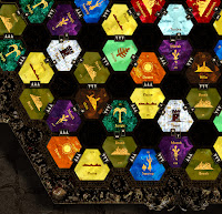 le can turn into the opposite when on the keyboard – a click away from posting semi-anonymously. Certainly emotions do run higher with games that individuals are passionate about (like Titan) and have a long term relationship with. This causes discussions that tends to be less informative and more emotional and personal in nature. My personal believe is that posting in the forums is as much to do with ego and the impression of knowing more than the other guy than anything else. Consequently, discussions get fixated on unimportant details detached either from reality or out of proportion to the merits of all the good that surrounds products/projects in question. Little bits and parcels of knowledge are used for and blown into full fledge critiques of game and art. Additionally, criticisms also tend to run higher on higher profile subjects (whether game, designer, artist or concept – like game ratings). Oh well. I think it is better not to get involved with Geek, BGN or other forums as it just contributes to the atmosphere. Even if I add rational contributions based on professional experience, it will get inevitably get buried in the rubbish and give fuel to it.
I love games, love to laugh and love the company of others enjoying similarly. For me, games are a celebration of life and positive in nature. These hobby games we play are complicated expressions of this – both in terms of design and in terms of production. An incredible amount of thought, passion and talent goes into these productions. I know in the case of what I do, I bring to bear a lot of professional experience (as a director of large hard core design projects) and personal passion to create works of goodness. The forums, whether Geek, BGN or otherwise seems to attract individuals who distort the goodness of what has been created with their own narrow – typically black and white – visions of right and wrong. It is certainly not in the spirit of why I game and dampens the spirit and energy I bring to my work. Again, for me, it's better just not to be involved in it altogether.
As for production, yes, there are lots of decisions made according to cost which is handled by the publisher. I have certainly requested things and the publisher generally has always looked into costs and even upgraded to those suggestions.All the publishers I’ve worked with have been great that way. At the same time – as we
all have heard over and over – there is not that much money to be made. Lots of capital is needed to produce a game. Anything that is not the usual - like a custom bit - will add to costs, so all this must be monitored closely by the publisher. Want a card that bleeds off the sides? That will cost you quite a bit, as a for instance. This being said, the publishers are gamers too. They want to see their product look like they would want a game in their collection to be. Since there is not that much money in it, there is that emotional component as a driver – which is huge. They're driven by this pride to see a high quality product that they, personally, can be proud of. In the end, all these faceless companies are really just a couple guys each, generally really nice, working really hard to create something they will really love.
Unfortunately making games is very complicated. There are lots of different parts and pieces that need to come together. This complicated manufacturing process can lead to crazy unpredictable things that happen along the way. Communications with the printer can be problematic at times too. Given that a huge percentage of games are printed at the same time for the same show (Essen), at times, printers can be less than responsive with getting back to publishers/artists due to their overload. This can cause last minute changes that can effect the final production and can be one of the most frustrating things in the process, actually. In one case, we wanted a special bit, but the printer never got back to us on costs or if they could make it properly. Months went by with no communication despite countless emails. Everything was due to print – rules, box, everything. What do you do? Do you simply pull the bit –forget it, we’ll use stock – to insure the image is correct in the rules and on the box? Maybe, but the stock piece doesn't happen to fit on the space on the board so the board will have to completely be redesigned at the last minute. Or perhaps we should not picture this custom bit in the rules and use
some abstract icon in the event it changes? Or perhaps will they come through? (In the end, they came through.) Here is the thing that bugs me with the forums and conversations in it. Individuals make comments based on what would appear to be logical assumptions. The real world and operations is completely illogical at times. Things happen based on the craziest circumstances. In this case, needless communication breakdown. Logically, things might seem to an outsider as if a publisher or artist does not know what they are doing. In reality, stuff just
comes up. On the positive side, though, looking at the general quality of games, it is good to see the high level that is being achieved compared to what I grew up with in the 80's. Given inflation, I think there is good value in all these productions and is something for the industry to take pride in. These games are truly exciting products growing ever more sophisticated and masterful in design and execution. I'm very positive for the future of gaming!
Malloc: Mike, I would like to thank you for your time and for providing us with some vision into a side of game development that many gamers know very little about.
Mike Doyle: Thanks for your interest!
This is a copy of an article originally published on the old F:AT blog. Read original comments .
 Games
Games How to resolve AdBlock issue?