 How to resolve AdBlock issue?


What are the worst box cover designs, among the Essen '08 crop of games? Why does it matter? Here's a countdown of ten of the worst offenses to art and beauty that were displayed at the Messe, accompanied with technical and aesthetic analysis from a real, live art school dropout.
Comptetent graphic design is, above all, about clear communication. What does a graphic designer seek to communicate through the design of the box cover? It varies, of course, from situation to situation, but it's safe to say that the two most important bits of information that must be expressed are:
1. the title of the game
2. the intended audience
A casual consumer should be able to glean this information from the box cover instantly, and it's the graphic designer's responsibility to ensure that's possible.
Here's a simple example:

This design isn't especially exciting or unique, but it gets one thing crystal clear: the game's title. The designer achieved this clarity by employing the most basic trick in the graphic designer's book, simultaneous contrast of hue. When you place red letters on a green background, the invitable result is that the letters will stand out. You can't miss them, unless you're color-blind. The principle of simultaneous contrast dictates that when you put a shape of one color beside its complement, you emphasize the color of both. Place a green figure beside a red figure, and the green figure will look more green as a result, and the red figure will look more red.
One the other hand, if you want to make it difficult to read your game's title, do this:

Blue text is hard to read. A healthy human retina is less sensitive to variations in the color blue than any other color. If you're going to use blue text in a graphic design, one way to ensure that it's readable is to place it on an orange background, so that simultaneous contrast helps the letters to appear crisp and distinct. The cover of DOMINION sets the game's title against its own drop shadow, and the resulting blue-on-black color scheme is illegible. This is an ugly, obscure graphic design that attests to the amateur status of the game's developers.
Of course, complementary contrast isn't always appropriate. The graphic designer might use it to emphasize the most important points she's trying to communicate, but excessive use of contrast can create visual confusion.
Here's an example of a box cover that's visually confusing because it doesn't have enough of a different sort of contrast:

It's kinda cool, but it's loud and busy. The designer didn't give us any place to rest our eyes, and the complicated visual texture of the battle scene distracts us from the game's title. What's needed here is some contrast of texture. It's OK to include busy textures in a design as long as there's some whitespace, too. When used competently, whitespace can emphasize an element (like the title) by isolating it. More generally, whitespace can make a composition easier to read by organizing it, thereby leading the eye to the important information.
Of course, a competent graphic designer never leaves whitespace in a composition simply because she didn't know how to fill it:

The stairs in the illustration do a good job of guiding our eyes from Cardinal Richelieu in the background over to Louis XIV in the bottom right corner, and back to the dude in the orange coat. The basic shape of the composition here is a spiral; a common design choice that you see all the time in old paintings and Jack Kirby comics panels. The thing about spiral-shaped designs, though, is that you have to put something near the center. This illustration has a big, empty, uninteresting space right in the middle.
Here's an unfortunate composition that conveys the wrong message about the game's intended audience:

It's a nicely rendered portrait of American folk hero John Henry, but it's also unintentionally erotic. The main vectors of the composition point directly at Henry's golden spike. The designer should be directing our attention toward the title, not down there. My eyes are up here, fellas.
Here's a not-so-nicely rendered portrait:

This has got to be the most common beginner's mistake in any life drawing studio course. Humans have large brain cases. The span from your chin to your eyes is roughly equal to the height of your forehead. Your face really only covers a small proportion of the surface of your head. Let's see how this guy measures up:

Now that we've seen the first half of our top-ten lineup, let's take a break to review the graphic design rules that we've already covered:
1. be aware of simultaneous contrast of hue; use it to make the design clear, and to ensure that the title is legible
2. be aware of texture; judicious use of whitespace can clarify the design by isolating important elements
3. whitespace is a design element, so use it deliberately; simply leaving empty space in the design because you didn't know how to fill it is a major faux pas
4. be aware of the way in which your composition can lead the eye of the viewer to specific elements of your design; try to emphasize the game's title
5. every successful drawing begins from knowledge of human anatomy; this is especially true of stylized or abstract drawings
Number five in our countdown is remarkable because it runs afoul (pun intended) of nearly all of these rules:

Why does the title look like crap? Because black-edged text was imposed on a black background. In fact, this whole design is a murky, indecipherable mess because of a consistent failure to use contrast of hue or texture (or any of the other important kinds of contrast) to achieve clarity. The black-on-black color scheme afflicts not just the text, but also the spaceship and the paint bucket. What's more, the bucket is doubly confusing because it's camouflaged not just against the black spaceship, but also the blue planet!
Diagonal compositions are usually a pretty safe choice, but there are vast expanses of uninteresting space in this design, especially above the text and along the right hand side of the box. The designer tried to fill some of that space with what appear to be an artificial satellite, a moon, some money, and a rocket, but the result is weak, because these elements are so tiny. Awareness of another kind of contrast, contrast of size, would have helped enormously here. Imagine if the moon had been given a distinctive color, made much larger, and shifted a bit to the left; all at once, we'd have filled much of the blank space, added texture and interest to the design, and interposed an element between the ship and the background, thereby eliminating some of the black-on-black non-contrast.

Why contrast a white dog against a white pier? Why position the dog so that the seated man's foot is obscured, when the dog could have been shifted right just a bit, filling some dead space and resolving the visual confusion? Most importantly, though, if you're going to use 2-point linear perspective like this illustrator did, at least use a freaking ruler:

IMPORTANT CORRECTION: when this article was first published, I incorrectly attributed the graphic design of MASTER BUILDER to Mike Doyle. The designer is actually Matthias Catrein. I apologize sincerely to both Mr. Doyle and Mr. Catrein for the error.

What's with all the sloppy whitespace around the MASTER BUILDER logo? And why the brown-on-brown typography? Why was the head cropped off the figure at the right edge of the illustration?
The real problem, though, is that the illustration is so flat. The image is all in the middle ground. There's nothing in the foreground, and there's no background, apart from the sky. It's just a bunch of buildings, so we have lots of similarly sized rectangles, and lots of unrelieved symmetry. The illustration has little visual depth or dimension.
I want to make it clear that I'm not insisting that every design should employ lurid color and aggressive asymmetry. I am, however, insisting that every design should at least not be boring.
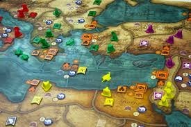
Over the years, Eurogames have settled into cliche and convention. One of the principal cliches of the genre is the historical setting, so it makes sense that graphic designers working in Eurogames have frequently alluded to art history in their box illustrations. Some designers have a deep knowledge and genuine affection for the history of fine art, but not all of them:

The photograph on which this design is based is actually quite good. The composition is nice, and the photographer made capable use of simultaneous contrast of color. Unfortunately, a funny thing happened to this image on the way to the printing press: it got into the hands of someone who has internalized all of the awful Eurogame stylistic conventions. There's nothing wrong, you know, with simply publishing a photo on your box top. In the world of Eurogames, though, photographic game boxes have somehow become outre, while art historical allusions demonstrate good breeding. TULIPMANIA 1637 takes this bit of received wisdom to its logical extreme by applying the Photoshop "Palette Knife" filter to an otherwise nice cover illustration. In the process, it uglifies the image mercilessly. Further, it creates something that signifies fine art without actually resembling fine art. In fact, no 17th Century Dutch painter would have created a painting like this one. The Old Masters simply didn't use the palette knife painting technique. Franz Hals is probably the most notable alla prima painter of the period, and even he used brushes. Furthermore, his colors and compositions were nothing like this.
Sure, the typography is amateurish, colorless and unimaginative, but I'll let that go. The real problem with this design is that it's phony and dishonest. It strives to connote sophistication, but the designer hasn't earned that sophistication.
The "I don't know anything about art, but I know how to use Photoshop" design aesthetic is also evident in the #1 game in our Worst-Dressed Countdown. This is not just the ugliest Essen release of 2008, it's one of the ugliest board games ever published.

I can't do any better than MattDP's summation: "the horror is almost too much to contemplate."
CORRECTION: In the following paragraph, I claimed that DUCK DEALER had a print run of only 200 pieces. It was subsequently pointed out that the actual run was 1500 copies, though only 200 were available at Essen.
Does any of this matter? Maybe not.