I’m routinely picking up heavily themed games and looking at the manual and shaking my head. Why such heavy handed fake parchment backgrounds all the time? It makes reading more difficult than it needs to be and it does nothing for the game’s immersion factor. Maybe it’s the sign of a “quality” game.
I’d be super happy if companies would just publish the rules on a white background. Am a crotchety old gamer or a sophisticated student of the Tufte ink to information ratio principle?
It's nice to have some style, but I agree that style should never come before readability. I have had to read several rule books with a magnifying glass. :/
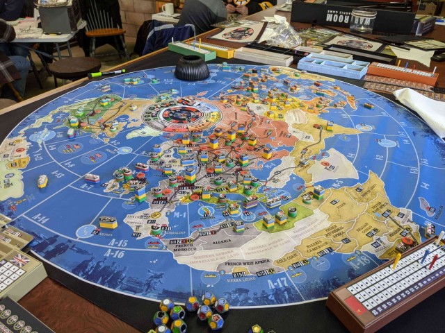
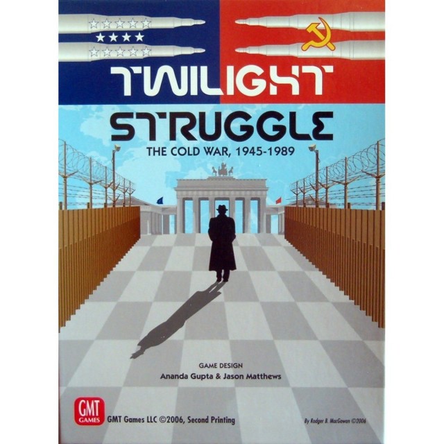
All rulebooks should look like wargame rulebooks (I'm thinking specifically of GMT's or MMP's stuff): nice columns, numbered rules, and very plain backgrounds.
Edit: obviously the actual text can vary from that. Wargame style writing is definitely not for every game.


 How to resolve AdBlock issue?