

 How to resolve AdBlock issue?
 - Posts: 3078
- Thank you received: 2364
×
Bugs: Recent Topics Paging, Uploading Images & Preview (11 Dec 2020)
Recent Topics paging, uploading images and preview bugs require a patch which has not yet been released.
×
Talk about whatever you like related to games that doesn't fit anywhere else.
Let’s Talk About Art and Graphic Design in Games
- Cranberries
-
- Away
- D10
-

- Don't give up.
Less
More
18 Nov 2018 10:58 - 18 Nov 2018 11:03 #286365
by Cranberries


<--not a game, but should be
Also a fan of Zimby Mojo:

These are just my preferences, which I secretly believe are superior to your preferences.
Replied by Cranberries on topic Let’s Talk About Art and Graphic Design in Games
<--not a game, but should be
Also a fan of Zimby Mojo:
These are just my preferences, which I secretly believe are superior to your preferences.
Last edit: 18 Nov 2018 11:03 by Cranberries.
The following user(s) said Thank You: stoic
Please Log in or Create an account to join the conversation.
- Jackwraith
-
- Away
- Ninja
-

- Maim! Kill! Burn!
Less
More
- Posts: 4370
- Thank you received: 5697
18 Nov 2018 11:04 #286367
by Jackwraith
Replied by Jackwraith on topic Let’s Talk About Art and Graphic Design in Games
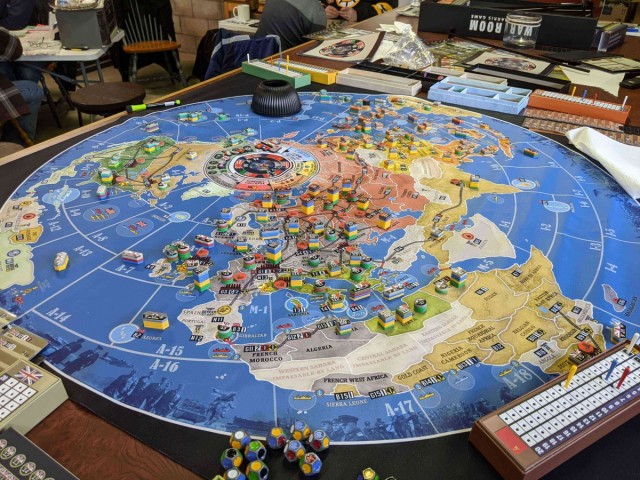
Msample, those are both great points. I think there is a distinct point where maps/boards reach a level of image confusion that detracts from what's happening, no matter how good it may look. Columbia's block games occasionally suffer from this, in that some maps are so icon-heavy that it becomes a point of confusion as to who is getting a defending bonus in Richard III and how many blocks have crossed which border and so on. The map is beautiful, but there's a potential for negative impact on game play. I still think one of the highest achievements in this respect remains Chaos in the Old World, where the spectacular presentation detracts not at all from interpretation and board state.
No board game artist that I've ever known has been solely a game illustrator. Even with the explosion of output in recent years, I'm not sure that that's even a viable approach for most artists.
No board game artist that I've ever known has been solely a game illustrator. Even with the explosion of output in recent years, I'm not sure that that's even a viable approach for most artists.
Please Log in or Create an account to join the conversation.
18 Nov 2018 11:12 - 18 Nov 2018 11:15 #286369
by Gary Sax
Replied by Gary Sax on topic Let’s Talk About Art and Graphic Design in Games
Boy, to Msample's point, U.S. Civil War sure does look great (Simonitch).
I think Here I Stand has excellent graphic design even if it has a tiny bit of that Rodger McGowan clipaet thing going on. So does Virgin Queen.
In my collection outside of wargames... John Company has *amazing* graphic design and art.
I think Here I Stand has excellent graphic design even if it has a tiny bit of that Rodger McGowan clipaet thing going on. So does Virgin Queen.
In my collection outside of wargames... John Company has *amazing* graphic design and art.
Last edit: 18 Nov 2018 11:15 by Gary Sax.
Please Log in or Create an account to join the conversation.
- hotseatgames
-
- Away
- D12
-

Less
More
- Posts: 7177
- Thank you received: 6295
18 Nov 2018 11:31 #286370
by hotseatgames
That is a luxury generally not afforded in the traditional designer > publisher > artist scenario. The publisher is a literal wall in the middle. You might get some input, you might not. Your input might be listened to, it might not.
Replied by hotseatgames on topic Let’s Talk About Art and Graphic Design in Games
xthexlo wrote: In my opinion, game designers should begin interacting with conceptual artists when they begin to interact with play testers.
That is a luxury generally not afforded in the traditional designer > publisher > artist scenario. The publisher is a literal wall in the middle. You might get some input, you might not. Your input might be listened to, it might not.
Please Log in or Create an account to join the conversation.
18 Nov 2018 13:26 #286374
by Shellhead
Replied by Shellhead on topic Let’s Talk About Art and Graphic Design in Games
Graphic design is an extremely important and under-rated element of board game design. Good graphic design makes it easier to play the game and also more enjoyable. Poor graphic design can work against the game and even make it harder to get to the table.
Art is not quite as crucial in a board game, and most board game art falls considerably short of greatness. Board game boxes are even worse, as drawing attention is more important than looking nice.
The distinction between graphic design and art is possibly opaque to some people. Art is the picture on the box cover and rule book, and maybe the pictures on the cards. The sculpt of the miniatures is also art. Graphic design is more functional in orientation, like the layout of the board and the rule book, appearance of icons, selection of fonts, color palettes for components, maybe even flourishes like the borders on cards.
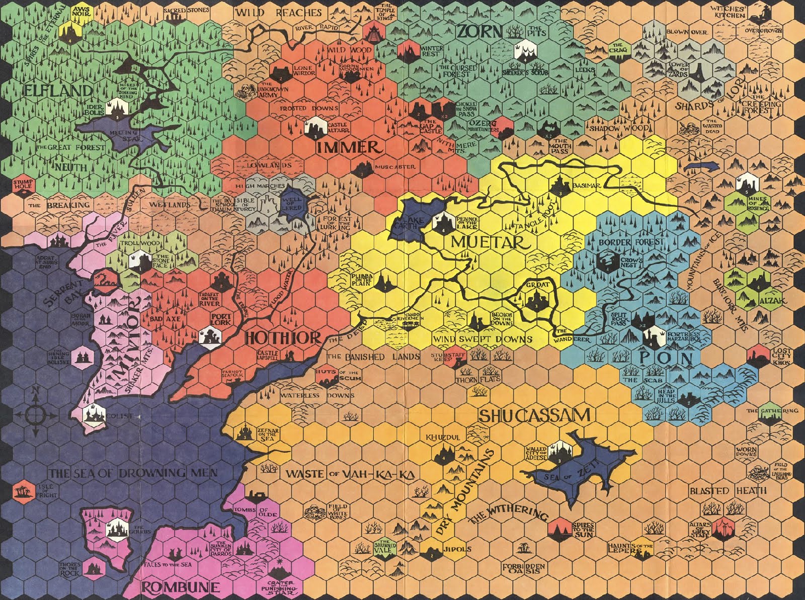
I've always been fond of the graphic design of the first edition Divine Right map:
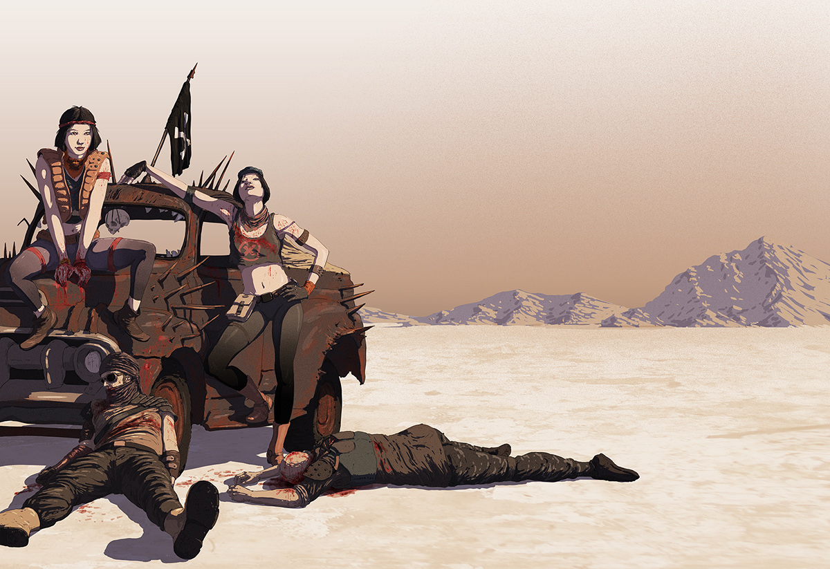
Saltlands had some very nice art:
Art is not quite as crucial in a board game, and most board game art falls considerably short of greatness. Board game boxes are even worse, as drawing attention is more important than looking nice.
The distinction between graphic design and art is possibly opaque to some people. Art is the picture on the box cover and rule book, and maybe the pictures on the cards. The sculpt of the miniatures is also art. Graphic design is more functional in orientation, like the layout of the board and the rule book, appearance of icons, selection of fonts, color palettes for components, maybe even flourishes like the borders on cards.
I've always been fond of the graphic design of the first edition Divine Right map:
Saltlands had some very nice art:
Please Log in or Create an account to join the conversation.
- Erik Twice
-
- Offline
- D8
-

- Needs explosions
Less
More
- Posts: 2300
- Thank you received: 2650
18 Nov 2018 17:27 #286378
by Erik Twice
And that's not what the game is about! The game is about High Society being fruitless, a rat race where someone always loses and ruled by frivolous spending and vanity. All the stuff you buy in the game is an excess. It's not something valuable, it's a way to prove you are better than other people. Breaking societal roles, like a black man using perfume or a woman dressing in men's clothes does not fit the conception of the game.
Anyways, it's just something I've been trying to put into words lately. I should turn into an article. I've actually thought about it, though I want to be careful not to come across as rude or unfair towards the artist.
Replied by Erik Twice on topic Let’s Talk About Art and Graphic Design in Games
Nah, it's not that at all. The artist is a "progressive" person, as we say in Spain, and she simply thought that diversity and representation was a nice addition. She also uses a very pretty, beautiful style with religious influences and a bit of Belle Epoque and that would normally be awesome except it has the effect of portraying High Society and your acts in the game as something good.mc wrote: There's possibly a case to be made that that simply represents the perceived decadence of fast and loose high flyers but my generally liberal head might explode if I keep thinking too hard about it.
Although perfume for a male isn't so weird, is it? Especially not in quasi frenchy belle epoque fantasy land.
And that's not what the game is about! The game is about High Society being fruitless, a rat race where someone always loses and ruled by frivolous spending and vanity. All the stuff you buy in the game is an excess. It's not something valuable, it's a way to prove you are better than other people. Breaking societal roles, like a black man using perfume or a woman dressing in men's clothes does not fit the conception of the game.
Anyways, it's just something I've been trying to put into words lately. I should turn into an article. I've actually thought about it, though I want to be careful not to come across as rude or unfair towards the artist.
Please Log in or Create an account to join the conversation.
- hotseatgames
-
- Away
- D12
-
Less
More
- Posts: 7177
- Thank you received: 6295
18 Nov 2018 19:29 #286382
by hotseatgames
Hopefully some day, it's not an "addition", and it will just be how things are. Games aren't just for white dudes.
Replied by hotseatgames on topic Let’s Talk About Art and Graphic Design in Games
Erik Twice wrote: ... she simply thought that diversity and representation was a nice addition. ...
Hopefully some day, it's not an "addition", and it will just be how things are. Games aren't just for white dudes.
Please Log in or Create an account to join the conversation.
- Erik Twice
-
- Offline
- D8
-
- Needs explosions
Less
More
- Posts: 2300
- Thank you received: 2650
18 Nov 2018 19:56 #286383
by Erik Twice
Replied by Erik Twice on topic Let’s Talk About Art and Graphic Design in Games
That's what I hope, too. "Addition" might not be the best way to put it, but I think it gets the point across.hotseatgames wrote:
Erik Twice wrote: ... she simply thought that diversity and representation was a nice addition. ...
Hopefully some day, it's not an "addition", and it will just be how things are. Games aren't just for white dudes.
Please Log in or Create an account to join the conversation.
18 Nov 2018 20:24 #286384
by DarthJoJo
Replied by DarthJoJo on topic Let’s Talk About Art and Graphic Design in Games
So why doesn’t real modern art ruin Modern Art for you, Erik? Your argument against a diverse cast in High Society is the disconnect between theme and presentation, but isn’t the same thing going on in CMON’s edition and everyone’s homemade versions with Van Gogh or whomever?
Modern Art is a satire. You are literally creating monetary value from pure demand. The price of the art at the end of each round has nothing to do with the quality of the pieces but with how much everyone else wanted the associated artist. The Mayfair edition makes this explicit with fake pull quotes in the manual, if the winner being determined by who has the most money wasn’t already pointed enough. The CMON rules instead have double page spreads about the real artists and art printed on their cards. That’s cool, but something important is lost from the game as a result.
Modern Art is a satire. You are literally creating monetary value from pure demand. The price of the art at the end of each round has nothing to do with the quality of the pieces but with how much everyone else wanted the associated artist. The Mayfair edition makes this explicit with fake pull quotes in the manual, if the winner being determined by who has the most money wasn’t already pointed enough. The CMON rules instead have double page spreads about the real artists and art printed on their cards. That’s cool, but something important is lost from the game as a result.
Please Log in or Create an account to join the conversation.
18 Nov 2018 20:53 #286386
by mc
Replied by mc on topic Let’s Talk About Art and Graphic Design in Games
Erik, would love to read any thoughts on it. I hope you're able to do it!
I look at High Society as being a satire on consumerism and class, no matter what else is going on. I personally don't see a disconnect with that theme because there are minorities represented - consumerism and class, they transcend that for me, so I didn't read the values represented as being good by association, just because there was some progressive representaton going on. So I'm happy to go, yeah, in this highly abstracted fantasy world, it's possible to be super rich and black or whatever, and still have your priorities all out of whack. I'm happy at the same time to think that it's good to have some interesting representation running concurrently.
I did notice the representation when I got the game, and, I don't know, it might be part of where I grew up a bit (in a former south pacific colony) but I didn't find it hard to imagine a kind of creole type society that would fit, if I wanted it to. And race, and gender and all the rest are more complicated than they often appear to be from the distance of hundreds of years as well anyway.
Please Log in or Create an account to join the conversation.
18 Nov 2018 21:13 #286388
by Hadik
Agree that he’s had some misses, but I’d still rather play one of his maps because I enjoy his style. Very interesting and evocative. I’m the same shallow sort of wargamer that prefers tanks and dudes rather than NATO symbols. Simonitch does fine maps but they are stuck in the 70s.
I did art for four small publisher games and based on the hours I put in I got paid very little. Still, I enjoyed the challenge.
Replied by Hadik on topic Let’s Talk About Art and Graphic Design in Games
Msample wrote: There are maps that are suitable for wall framing, but fail the functionality test, sometimes alarmingly so. Mark Mahaffey is the poster child for this. At times he produces maps that do both, but too many times he "pushes the envelope" for the sake of being different and is notoriously tone deaf...
Agree that he’s had some misses, but I’d still rather play one of his maps because I enjoy his style. Very interesting and evocative. I’m the same shallow sort of wargamer that prefers tanks and dudes rather than NATO symbols. Simonitch does fine maps but they are stuck in the 70s.
I did art for four small publisher games and based on the hours I put in I got paid very little. Still, I enjoyed the challenge.
The following user(s) said Thank You: Gary Sax
Please Log in or Create an account to join the conversation.
- Erik Twice
-
- Offline
- D8
-
- Needs explosions
Less
More
- Posts: 2300
- Thank you received: 2650
19 Nov 2018 05:38 #286433
by Erik Twice
Note that this doesn't ruin the game for me or anything. I just think there's a thematic disconnect. And it's not like the edition isn't pretty and the vast majority of other editions are of much lower quality so.
Replied by Erik Twice on topic Let’s Talk About Art and Graphic Design in Games
Because I have never played Modern Art. Like, I can see this being the case, but I can't say because I haven't played it. Everytime it's time to play a game at the club I suggest it, but either we hav the wrong player number or it's too much of a filler and people want something longer. So yeah, haven't played it.DarthJoJo wrote: So why doesn’t real modern art ruin Modern Art for you, Erik? Your argument against a diverse cast in High Society is the disconnect between theme and presentation, but isn’t the same thing going on in CMON’s edition and everyone’s homemade versions with Van Gogh or whomever?
Note that this doesn't ruin the game for me or anything. I just think there's a thematic disconnect. And it's not like the edition isn't pretty and the vast majority of other editions are of much lower quality so.
The following user(s) said Thank You: DarthJoJo
Please Log in or Create an account to join the conversation.
Less
More
- Posts: 1460
- Thank you received: 1206
19 Nov 2018 07:42 - 19 Nov 2018 07:46 #286459
by WadeMonnig
Replied by WadeMonnig on topic Let’s Talk About Art and Graphic Design in Games
I thought the default Inis artwork was cool.
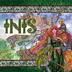
Until I saw the Polish version
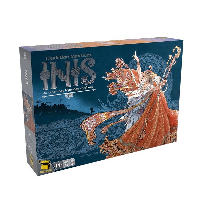
And the new Matagot Version
Until I saw the Polish version
And the new Matagot Version
Last edit: 19 Nov 2018 07:46 by WadeMonnig.
Please Log in or Create an account to join the conversation.
19 Nov 2018 08:54 - 19 Nov 2018 08:58 #286472
by Jexik
Replied by Jexik on topic Let’s Talk About Art and Graphic Design in Games
Although the art in Settlers of Catan is always boring in any edition, I find the consistency of the colors used and the clarity on the reference sheet make it one of the easiest games to teach.
As a resident PHG fanboy and ex-demoer, Fernanda Suarez' art (Ashes, Dead of Winter) was a consistent draw for fans. Especially among women and others that you'd often consider minorities in the gaming community. Isaac seems to have made it an unwritten rule to push for more inclusion in their games, even comparing the cast in the Dead of Winter expansion to the first box. Since I studied Econ and not Art, this is the type of lens I see this stuff through. When sitting in the shop, the white Ashes box always popped, kind of like the old Final Fantasy VII effect. Pre-Isaac's influence and shot-calling you got stuff like the original Summoner Wars box and City of Remnants.
Sirlin's Puzzle Strike box will forever baffle me. It does not say "this game is like Dominion, but better!"
Last edit: 19 Nov 2018 08:58 by Jexik.
Please Log in or Create an account to join the conversation.
- Legomancer
-

- Offline
- D10
-
- Dave Lartigue
Less
More
- Posts: 2944
- Thank you received: 3873
19 Nov 2018 09:06 #286475
by Legomancer
Replied by Legomancer on topic Let’s Talk About Art and Graphic Design in Games
I always prefer more stylized, off-the-grid art to the same old either standard fantasy nonsense or the "art should be as directly representational as possible" stuff. If a card represents a ship and you put just a picture of a ship on it, well, I guess that's better than just the word "SHIP" but there's only so much I'll care about how well that ship is painted. Art is a place to give your game some character and too many publishers roll with obvious cliched stuff.
Please Log in or Create an account to join the conversation.
Moderators: Gary Sax
Time to create page: 0.448 seconds