


 How to resolve AdBlock issue?
 - Posts: 16929
- Thank you received: 10375
×
Bugs: Recent Topics Paging, Uploading Images & Preview (11 Dec 2020)
Recent Topics paging, uploading images and preview bugs require a patch which has not yet been released.
×
Talk about other nerd culture stuff in here.
Top 5 Game Box Art
- Michael Barnes
-
- Offline
- Mountebank
-

- HYPOCRITE
Less
More
02 Oct 2012 17:04 #135389
by Michael Barnes
Replied by Michael Barnes on topic Re: Top 5 Game Box Art
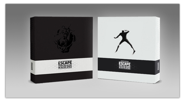
I like the black embossed one better, but both of these are very nicely executed...far more effective and evocative than a bunch of fucking Trapper Keeper artwork.
I actually think this game is one of the best looking on the market...surprising since it used t be literally the ugliest game on the market. But man, the choice of colors...I get it, and it's really appropriate...but it's the team colors of the Nazis.

This is probably the best board game package design I've ever seen. I regret selling it only because it looks amazing. If only other board game graphic designers had this sense of economy and atmosphere.

In sum, all black and no shitty fantasy drawings.
I actually think this game is one of the best looking on the market...surprising since it used t be literally the ugliest game on the market. But man, the choice of colors...I get it, and it's really appropriate...but it's the team colors of the Nazis.
This is probably the best board game package design I've ever seen. I regret selling it only because it looks amazing. If only other board game graphic designers had this sense of economy and atmosphere.
In sum, all black and no shitty fantasy drawings.
Please Log in or Create an account to join the conversation.
02 Oct 2012 17:05 - 02 Oct 2012 17:06 #135390
by Shellhead
Replied by Shellhead on topic Re: Top 5 Game Box Art
I struggled with this. Most board games have lousy artwork on the cover. The euros are too brown and drab, because their players tend to feel secret self-loathing about the fact that they are playing games. So they need their games to look very serious. Most other games are trying to hard to grab attention, and rely on bright colors and garish art to shout CHOOSE ME.
My favorites:
1. Arkham Horror: the Curse of the Black Pharoah expansion (revised edition): Too many of the Arkham Horror box covers feature excessively large tentacles, and that gets so samey. But this one is different, and really nice. The lighting of the foreground is dramatic, and really enhances the lunging mummy and the flying shards of glass. The background lighting is a luminescent blue glow that contrasts nicely with the brown and tan details in the foreground.
1. Fury of Dracula (FFG version): Nice use of color, and the picture evokes a sense of speed and urgency. I can practically hear that whip crack when I look at the cover.
3. Mall of Horror: Most zombie game box covers bore me. Maybe it's just because the zombie theme has gotten so pervasive and tedious in various forms of entertainment in recent years. But that zombie on the cover of Mall of Horror is very striking, and the contrast with that bold yellow border really punches up the impact.
4. Divine Right (TSR version): The cover is garish but somehow in an over the top Moorcockian '70s way. Maybe I just like the unusual juxtapositions of colors. Always made me think of that song Ghost Riders in the Sky.
5. Arkham Horror base set (FFG): I like the semi-realistic artwork of the Arkham Horror covers in general, and this one wins out because my favorite color is green. And there is a dude unloading a tommy gun at the monster, and a big full mooon in the background.
Two covers that I hate:
1. Strange Synergy: Yeah, I like superheroes. And I like Phil Foglio artwork if used in a funny context. But he didn't draw superheroes for the cover of this game about superhuman teams battling it out, he drew some lame b-s twinks and furries. I hated it so much that I re-covered my box lid with a scan of the cover to Justice Machine vs. the Elementals #2. And then I replaced the cardboard heroes inside with generic superhero pictures from somebody's online Champions game site.
2. Betrayal at House on the Hill (1st edition): With 50 scenarios, there were a lot of possible interpretations for this cover. The second edition cover was pretty damn good, and almost made my list above. But the first edition Betrayal cover is shitty, because the traitor looks like a refugee from Planet of the Apes. When I think of traitors and haunted houses and random horror, my thoughts never seem to travel in the direction of angry simians. I'm halfway tempted to cover up this box cover, too, with a scan of the second edition cover.
Last edit: 02 Oct 2012 17:06 by Shellhead.
Please Log in or Create an account to join the conversation.
02 Oct 2012 17:20 - 02 Oct 2012 17:23 #135391
by repoman

More than team colors. That eagle is a totally the Nazi Eagle and not the Roman one. The old Glory to Rome might have been ugly but at least it was distinctive.

The new "clip art" Glory to Rome is drab.
Replied by repoman on topic Re: Top 5 Game Box Art
Michael Barnes wrote: I actually think this game is one of the best looking on the market...surprising since it used t be literally the ugliest game on the market. But man, the choice of colors...I get it, and it's really appropriate...but it's the team colors of the Nazis.
More than team colors. That eagle is a totally the Nazi Eagle and not the Roman one. The old Glory to Rome might have been ugly but at least it was distinctive.
The new "clip art" Glory to Rome is drab.
Last edit: 02 Oct 2012 17:23 by repoman.
Please Log in or Create an account to join the conversation.
- hotseatgames
-
- Offline
- D12
-

Less
More
- Posts: 7177
- Thank you received: 6295
02 Oct 2012 17:29 #135392
by hotseatgames
Replied by hotseatgames on topic Re: Top 5 Game Box Art
The reason I like the 1st edition Betrayal cover is that it reminds me of old Vincent Price movies.
Please Log in or Create an account to join the conversation.
02 Oct 2012 18:09 - 02 Oct 2012 18:29 #135396
by Ska_baron

Replied by Ska_baron on topic Re: Top 5 Game Box Art
Last edit: 02 Oct 2012 18:29 by Ska_baron. Reason: sizing is not as intuitive as one might think
The following user(s) said Thank You: mads b.
Please Log in or Create an account to join the conversation.
02 Oct 2012 18:32 #135397
by VonTush

Replied by VonTush on topic Re: Top 5 Game Box Art
Please Log in or Create an account to join the conversation.
- Erik Twice
-
- Offline
- D8
-

- Needs explosions
Less
More
- Posts: 2300
- Thank you received: 2650
02 Oct 2012 18:50 #135399
by Erik Twice
Replied by Erik Twice on topic Re: Top 5 Game Box Art
Not sure if kidding, or bad taste.
Anyways, the art direction alone is what makes me consider this game:

Shame the minis are so expensive
Anyways, the art direction alone is what makes me consider this game:
Shame the minis are so expensive
Please Log in or Create an account to join the conversation.
02 Oct 2012 19:51 #135405
by VonTush
Replied by VonTush on topic Re: Top 5 Game Box Art
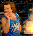
I think it is just a great cover. Makes me smile every time. From 70's/80's turn of the decade fashion, the six cigarettes the guy's using, the spoofs of popular packs, the "Warning", the fact that he's trying to light an already lit smoke. It reminds me of a cover to MAD Magazine.
Please Log in or Create an account to join the conversation.
Less
More
- Posts: 1897
- Thank you received: 1268
02 Oct 2012 20:04 #135407
by the_jake_1973
Replied by the_jake_1973 on topic Re: Top 5 Game Box Art
I always liked the cover of Flight Leader from Avalon Hill.
The 1st ed Blood Bowl and Epic Spell Warz are some faves as well.
The 1st ed Blood Bowl and Epic Spell Warz are some faves as well.
Please Log in or Create an account to join the conversation.
02 Oct 2012 20:44 #135415
by wadenels
Replied by wadenels on topic Re: Top 5 Game Box Art
I don't have a "Top 5", but I've always really liked:

You know how to tell if a box has a bunch of awesome shit inside? It has a cover like that.
You know how to tell if a box has a bunch of awesome shit inside? It has a cover like that.
The following user(s) said Thank You: mjl1783, DeletedUser
Please Log in or Create an account to join the conversation.
02 Oct 2012 21:49 #135426
by Josh Look
Replied by Josh Look on topic Re: Top 5 Game Box Art
This is the box art by which all box art is judged.
Please Log in or Create an account to join the conversation.
02 Oct 2012 22:06 - 02 Oct 2012 22:06 #135427
by OldHippy
Replied by OldHippy on topic Re: Top 5 Game Box Art
The second I saw this it was my favorite of all time and remains so to this day.

Last edit: 02 Oct 2012 22:06 by OldHippy.
Please Log in or Create an account to join the conversation.
- Michael Barnes
-
- Offline
- Mountebank
-
- HYPOCRITE
Less
More
- Posts: 16929
- Thank you received: 10375
02 Oct 2012 22:20 #135429
by Michael Barnes
Replied by Michael Barnes on topic Re: Top 5 Game Box Art
The Battletech cover could spin us off into another thread...what are the iconic, classic pieces of game box art?
That's definitely one of them.
That's definitely one of them.
Please Log in or Create an account to join the conversation.
02 Oct 2012 22:25 #135430
by Shellhead
The Dune box cover seems iconic to me, at least by boardgame standards.
Replied by Shellhead on topic Re: Top 5 Game Box Art
Michael Barnes wrote: The Battletech cover could spin us off into another thread...what are the iconic, classic pieces of game box art?
That's definitely one of them.
The Dune box cover seems iconic to me, at least by boardgame standards.
The following user(s) said Thank You: Rliyen
Please Log in or Create an account to join the conversation.
- Black Barney
-
- Offline
- D20
-
- 10k Club
Less
More
- Posts: 10045
- Thank you received: 3553
02 Oct 2012 23:00 #135432
by Black Barney
Replied by Black Barney on topic Re: Top 5 Game Box Art
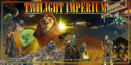
The warhammer mech on that Battletech cover is insanely iconic.
Mufasa on the Twilight Imperium cover is not.
Mufasa on the Twilight Imperium cover is not.
Please Log in or Create an account to join the conversation.
Moderators: Gary Sax
Time to create page: 0.196 seconds