- Posts: 1693
- Thank you received: 1703
- Forum
- /
- The Lounge
- /
- Mos Eisley Cantina
- /
- What are INNOVATIONS you would like to see in the board game industry?
Bugs: Recent Topics Paging, Uploading Images & Preview (11 Dec 2020)
Recent Topics paging, uploading images and preview bugs require a patch which has not yet been released.
Please consider adding your quick impressions and your rating to the game entry in our Board Game Directory after you post your thoughts so others can find them!
Please start new threads in the appropriate category for mini-session reports, discussions of specific games or other discussion starting posts.
What are INNOVATIONS you would like to see in the board game industry?
- Colorcrayons
-

- Offline
- D8
-

- Wiz-Warrior
Hex Sinister wrote: Cards, board game or CCG/LCG:
Get rid of black/white borders forever. Make font size bigger. Less words, more succinct. Never include flavor text.
I understand and agree with your statement about improvements, but may I ask why no flavor text?
I'm genuinely curious from the perspective of an end user, and from a person who is struggling to include flavor text on cards.
Please Log in or Create an account to join the conversation.
- Posts: 1478
- Thank you received: 609
To be clear, when I'm speaking of flavor text I'm referring to those little italic fictional quotes and background stuff that's on the bottom that have no effect on gameplay.
"You find a decapitated head with orange worms oozing out - make a sanity check", is NOT flavor text. That is story/adventure text in the game and is necessary and cool. I'm making this distinction because I've heard people refer to that as flavor text and disagree with that.
If you think FT adds to the experience please ignore me =)
Please Log in or Create an account to join the conversation.
- Posts: 1478
- Thank you received: 609
Please Log in or Create an account to join the conversation.
- ChristopherMD
-

- Away
- Road Warrior
-

- Posts: 5241
- Thank you received: 3796
"Yippeee!!!"
-Wise Old Dog
Please Log in or Create an account to join the conversation.
Colorcrayons wrote:
Hex Sinister wrote: Cards, board game or CCG/LCG:
Get rid of black/white borders forever. Make font size bigger. Less words, more succinct. Never include flavor text.
I understand and agree with your statement about improvements, but may I ask why no flavor text?
I'm genuinely curious from the perspective of an end user, and from a person who is struggling to include flavor text on cards.
I’m also anti-flavor text, and why that is is simple: Show, don’t tell. If you don’t have a quirk in the gameplay to distinguish what makes one monster unique from every other monster in your game, you need to stop worrying about writing that description that I’m going to ignore anyway (ok, maybe I’ll read it once) and go back to designing. Especially with stuff where there’s a familiarity in the subject matter. I know what a giant spider is, shut up and show me how you managed to abstract it ensnaring me in its web before it eats my guts. Even without any familiarity, it’s doable. More challenging, but doable. Starship Samurai, a game I’ve really taken a liking to, manages to express what makes each of its 8 different mechs unique with no flavor text, just a power and how it looks.
Game worlds are rarely interesting. Don’t waste my time and don’t waste yours, just design.
Please Log in or Create an account to join the conversation.
- Colorcrayons
-

- Offline
- D8
-

- Wiz-Warrior
- Posts: 1693
- Thank you received: 1703
The specific reason I was asking is my purpose in utlizing flavor text is because Wiz-War cards can be a bit wordy, and noobs quickly grasping what a card does can be a bit taxing.
I recall my first games of it, and while I could internalize each card quickly from game to game, staring at a hand of 5-7 card effects that take more than half the card real estate doesn't make for quick games. The quicker that the turns flow, the better.
I think relying on the image as not only a mnemonic, but as the flavor itself should suffice.
Perhaps I am overthinking it, and wasting my time. There are very few flavor text entries that I am genuinely proud of. The rest are just mediocre at best. They serve the purpose of briefly describing what the card does, but I am not Shakespeare.
To answer the question about memorable flavor text, I do know a few by heart because I think they were so metal.
Here is the flavor for the MTG card 'Seal of fire' (original print):
"I am the romancer, the passion that consumes the flesh.
~Seal inscription"
[Edit] I found an image of the card[/edit]
Appreciation is subjective, but to me, that has to be one of the best ever written.
The point made that they are largely unremarkable and unmemorable still stands, and I can't dispute it.
It confirms what I already suspected.
Thanks.
Please Log in or Create an account to join the conversation.
- Cranberries
-
 Topic Author
- Offline
- D10
-

- Don't give up.
- Posts: 3082
- Thank you received: 2371
The flavor text on Pax Pamir cards is historically interesting, and much like this image, too small to read.
I would also like to see publishers take their game art seriously. Look at this comment by Cole Wehrle:
A quick note on the cover:
The image used on the cover was first drawn by the surgeon James Atkinson during his stay with the British troops during the brief restoration of the Durrani dynasty. The original illustration, along with many others, were compiled and redrawn as lithographs in London and were ultimately published in 1842 as a volume entitled Sketches in Afghanistan. A second volume was planned but the illustrations were regrettably lost at sea or in the confusion of the end of the first Anglo-Afghan war (there is some debate on this subject among historians).
In doing research for the second edition of Pax Pamir, I discovered that a small print run of Atkinson's book was produced in full color, with many details hand-painted. With a little sleuthing I discovered one such copy held by the at the Toppan Rare Books Library at the University of Wyoming. Thanks to the excellent staff there, I obtained beautiful high resolution scans of the entire volume. The scans from this copy are used in many of the cards in the game.
This image, however, is not featured on any tableau card or event card in the game. It didn't quite make sense on any particular card. But, it is an excellent image for the cover. What you are looking at is a view of Kabul in the period of the game as viewed from the ancient palace and fortress of the Bala Hissar. This vantage would have been all to familiar to the many people who attempted to govern the wider region over the tumultuous period covered by the game.
I should say too that one of the things I really admire about Atkinson's work is the respect with which he treats his subjects. This is true of his contemporary James Rattray, whose work is also featured prominently in the game. The work is specific and powerful in its specificity.
Of course his illustrations have political overtones--he is a solider [sic] of the East India Company after all! With this in mind the illustration might take on a more sinister tone, telling the story of a Brit painting a landscape of domination. This might be a perfectly reasonable argument to make in our own time, but when one pushes against it, I'm not sure it holds water. In his caption, Atkinson notes the location of both he former home of Dost Mohammad and the current home of Shah Shujah. The picture might then be said to be about the transition of power and the stakes of the region's turmoil. Of course, that isn't meant to erase the politics of Atkinson's drawing, only to complicate them. And, within that frame I think he remains an excellent observer of the events unfolding around him, and well suited to a game that attempts, in its own small way, to grapple with some of those same subjects.
Please Log in or Create an account to join the conversation.
- hotseatgames
-
- Away
- D12
-

- Posts: 7178
- Thank you received: 6298
ChristopherMD wrote: "Yippeee!!!"
-Wise Old Dog
Ha! That is SOOO Wise Old Dog.
Please Log in or Create an account to join the conversation.
- Space Ghost
-
- Offline
- D10
-

- fastkmeans
- Posts: 3456
- Thank you received: 1304
Whenever one of us has a particularly good play, we often read the flavor text prior to revealing the card were going to play...for some reason, I find this funny. But, we have been playing against each other for 20+ years. If someone did that at a public tournament, I would want to punch them.
Please Log in or Create an account to join the conversation.
- Posts: 947
- Thank you received: 878
Please Log in or Create an account to join the conversation.
- SuperflyPete
-

- Offline
- Salty AF
-

- SMH
- Posts: 10733
- Thank you received: 5119
2. No plastic for plastic’s sake. I don’t need plastic models for every fucking thing in a game.
3. More pencil and paper, or “Clash of Cultures”’ type moving cube resource trackers. I don’t want 10,000 bits to track shit. Just give me a damned slider or something.
4. Lower parts count. Like #3, I don’t want a bunch of chits for the sake of chits.
5. Stacking cards. I want Mystic Vale type sleeves where you put your character in and then slide items or buffs and whatnot into the sleeve on top of the card so that I can look at one card to get all my info, not a huge tableau.
6. Smaller boards. Make 15mm miniatures and make the spaces smaller. There’s no reason for Elsritch Horror to have a massive board. Shrink that shit and make the pawns smaller!
7. Color blind friendliness. WTF, people have disabilities and color choices are largely irrelevant. Make color blind friendly shit!
8. THE BIG ONE: Fuck participation awards. Only publish great games. Not good ones, GREAT ones only.
Please Log in or Create an account to join the conversation.
Please Log in or Create an account to join the conversation.
- Forum
- /
- The Lounge
- /
- Mos Eisley Cantina
- /
- What are INNOVATIONS you would like to see in the board game industry?
 Games
Games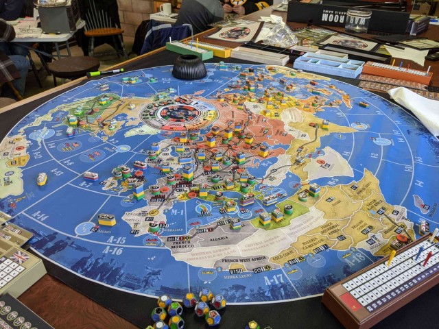



 How to resolve AdBlock issue?