I’ve been test playing the crap out of my new project. I think it will be 95% structurally complete by Gen Con, and I will be having some private plays there (shoot me a message if you are interested in joining a game). I just commissioned the card art.
It’s the game Mark mentioned about massive cosmic frogs. As Chris hinted, it builds on the lore of the Shadows of Malice universe.
Here is the dummy rule book cover and the first draft of the flavor page (for those familiar with Shadows of Malice, I hope it feels right to you).
xthexlo wrote: I’ve been test playing the crap out of my new project. I think it will be 95% structurally complete by Gen Con, and I will be having some private plays there (shoot me a message if you are interested in joining a game). I just commissioned the card art.
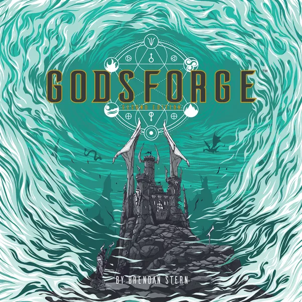
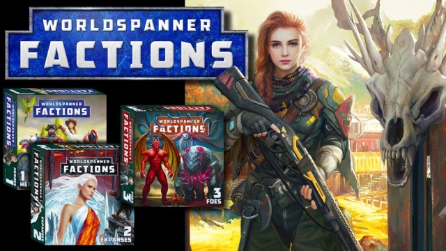
That said, I'm now thinking about two things: 1) Changing the title to Cosmic Frog, and 2) using a stark and simple box cover consistent with Shadows of Malice to reinforce the relationship between the two games (since this new game builds on the SoM lore). Here's my first idea of how it all comes together. I'd love to hear your thoughts, comments, etc.
Attachments:
Last edit: 07 Jul 2019 14:13 by xthexlo. Reason: Picture did not attach
I like your eye for design aesthetics, and that cover for Cosmic Frog is eye-catching. Although frogs exist in a wide range of colors, I think that people tend to associate them with the color green. So if it was just a game about frogs, you could get nearly as strong a contrast with lime green and black, like you used on the Shadows of Malice cover. But since the title is Cosmic Frog, it makes sense to go with a bold color that isn't typically associated with frogs. The overall layout is similar to Shadows of Malice, though the iconography is different, so I'm not sure that the visual identification will be automatic. Assuming similar graphics on the side of the book, the two games will look nice stacked on the shelf together.
I honestly don't know if we're the "right" people to ask, so to speak, because odds are the game is going to be so far in our collective wheelhouse that we'll all enjoy it.
With that said, I can't wait to try to convince people to try Cosmic Frog and answer their inevitable questions with vigorous pointing at the cover. And repeating "It's. Cosmic. Frog."
I like the idea of the SoM art style, but agree you should change the color to have it stand out. I'd also change the frog outline in the circle to look like your hulking cosmic frogs (understood this was a mock-up). But, I'm conflicted, as the box cover for SoM matches the art design throughout the game. If you're going to have all this new evocative art throughout Cosmic Frog, perhaps your cover should more closely match the game aesthetic?
I'm totally with you, Chris: on the one hand, cover consistency with SoM solidifies the story consistency; on the other hand, an evocative cover reflects the internal artwork. Right now, I'm leaning toward the SoM style.
As for the color... SoM was green on black, which is why I was looking for a color different than green. Of course, SoM was a sickly green, so a brighter, more yellowish green might play well. Orange is too halloweeny and blue felt wrong. I have to think a bit more. Maybe I was using the wrong shade of blue.
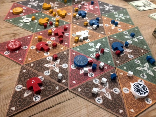
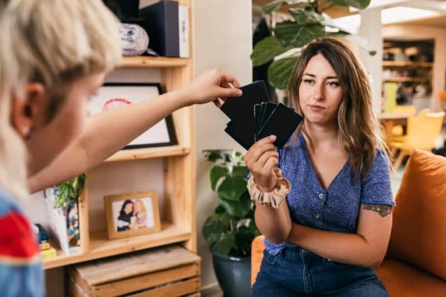
The layout looks great. You can fan the cards in your hand and easily pick out all the important icons on the left side of the card. I love the full bleed layout and used that style on my last boardgame project. The only improvement I can suggest for your card is to use a slightly lighter color of red in the text box, because the contrast between black text and dark red text might not be enough contrast. I vaguely remember some online site where you can post images and see how they appear to people with different types of color blindness, and you might find that the dark red text doesn't stand out well for someone with red/green color blindness.


 How to resolve AdBlock issue?