

 How to resolve AdBlock issue?
 Bugs: Recent Topics Paging, Uploading Images & Preview (11 Dec 2020)
Recent Topics paging, uploading images and preview bugs require a patch which has not yet been released.
The Art of Board Games
- oliverkinne
-
 Topic Author
- Offline
- D4
-

- All things tabletop.
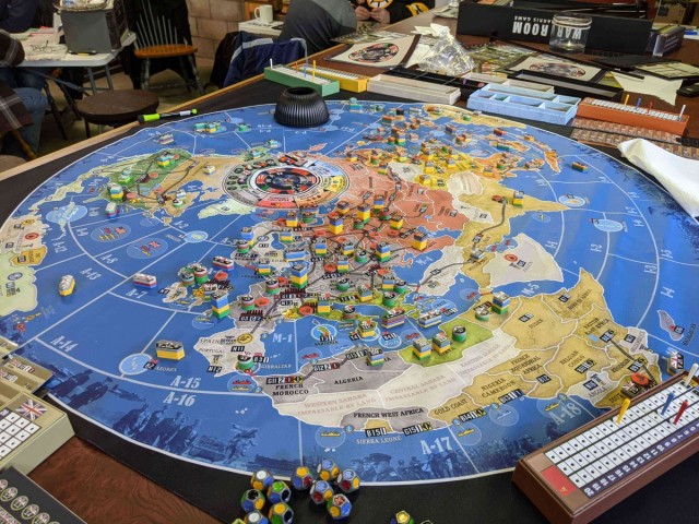
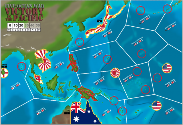
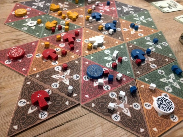
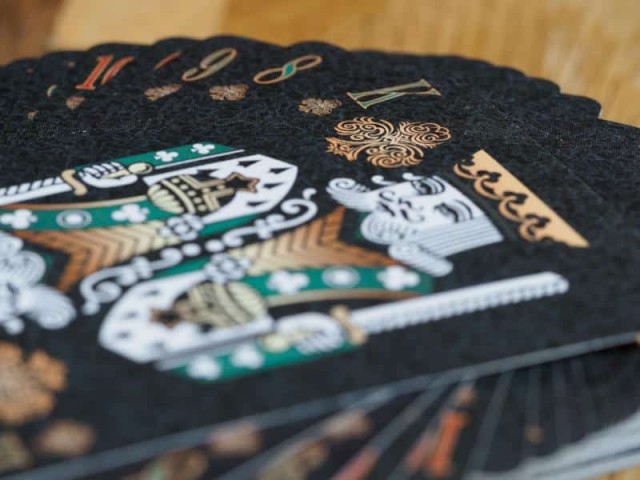
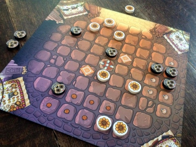
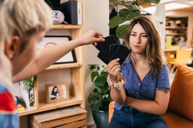
As many of you probably know, I am a very visual person. I love it when rulebooks are well laid out and have helpful photos that show how something works. The graphic design of game and player boards is also something I think is very important. A good choice of clear icons can really help with understanding how a game works and speed up the flow of a turn. Top it all off with beautiful board game art and you have the complete package, if you ask me.
Please Log in or Create an account to join the conversation.
I'm a visual artist and educator. Firmly rooted in middle age, I can make this simple declaration: Life is too short to play ugly games.
I've been critical on this site before about the 1st edition of Summoners Wars*. A great skirmish game marred by subpar illustrations. It was the first of many games I culled purely for aesthetic reasons:
Dungeon Saga
Survive! (Stronghold's 1st effort)
Epic Kingdoms
Zombies!!!
Zpocalypse
OGRE (SJG's bloated "designer edition")
That MtG Planeswalkers thingamajing
* PHG's release of a second edition with improved visuals was much needed. I bought the new master set.
Please Log in or Create an account to join the conversation.
I wonder if there is anyone out there who doesn't collect games from a specific publisher or designer but instead tries to get every game with a specific illustrator.
I do that with Ryan Laukat games!
In fact, the first game of Laukat's that I bought (Islebound), was solely based on the cover art. I'd never heard of the game, knew nothing about it, but instantly loved that cover when I saw it on the shelf at a game store. I bought it on a whim, which is not a thing that I often do. Turns out the game is great, and my son and I have played it probably more than any other game in my collection.
Please Log in or Create an account to join the conversation.
Please Log in or Create an account to join the conversation.
- southernman
-

- Offline
- D10
-

- TOTALLY WiReD
- Posts: 4217
- Thank you received: 1527
Many of my games have these properties, too many to talk about, but I will change to talking purely about games with (for me) outstanding pictorial artwork - and my two favourite so far, but by a large margin, are two of Awaken Realm's visual masterpieces, Tainted Grail and Etherfields (so much that I splashed out for sleeves for all cards). These two have just incredible, stunning art on all of their cards that really does increase the experience while playing, and are soon to be joined on my shelf by another stunning sibling ISS: Vanguard.
And then dropping just slightly in quality from those three are games that just have a cood combination of art and graphic design that match the game theme to, again, increase the experience when playing - just some of the games I have that do this include Nemesis, Machina Arcana, Waste Knights, Dungeon Degenerates, Shadowrun Crossfire,
And finally, I'm not a minis painter either but a year or so ago (after a lot of prompting from online articles, including people here) I decided to start dry-brushing some of the numerous grey plastic minis from my boardgames. I stuck to larger figures (due to eyesight, shakey hand, and lack of skill/patience) and though it took a lot longer than I wanted (I have poor patience for painting and take long breaks often) I have a few games now with minis that while no where near tabletop quality look great at 12 inches distance in a boardgame - Lords of Hellas and Bloodborne look so much better on the table now (and I have some evil looking nazis in Fortune and Glory).
In short, visual quality and tactile components greatly increase my enjoyment playing boardgames.
Please Log in or Create an account to join the conversation.
So art is good...til its not. FUNCTION first, then Form IMO.
Please Log in or Create an account to join the conversation.
drewcula wrote: I'm a visual artist and educator. Firmly rooted in middle age, I can make this simple declaration: Life is too short to play ugly games.
I agree. When I was younger, I picked up a number of different games. However, as I have gotten older, I have started only adding games to my collection if they are aesthetically pleasing. There are too many good games out there. I would rather play a game that is slightly less good but has good art than an ugly game that is only marginally better.
Please Log in or Create an account to join the conversation.
Msample wrote: One thing not really touched on here is art FUNCTIONALITY. I recently played a game called BARBARIANS AT THE GATES, a card driven game on the fall of the Roman Empire. Some interesting mechanics and at first glance, art that looked period specific - gloomy, matte and kind of darkish. However when game play commenced we started to see the shortcomings of the art. Dark printed city names on a brown province were very hard to read. Faint lines showing space connections required careful close up examination. In short, poor artistic choices hindered game play.
So art is good...til its not. FUNCTION first, then Form IMO.
A timely opportunity for me to quote from "The Tall Office Building Artistically Considered;"
Form follows function.
Thanks Louis Sullivan.
I just happen to prefer and play game forms that are pretty
Please Log in or Create an account to join the conversation.
Firstly, the kind of art that I really appreciate is often not the kind of art that it seems boardgamers like. This is before functionality comes into it at all, so, it's not about that. I often see lists of greatest boardgame art, and I'm like, eh, it just looks derivative to me. But I will occasionally see stuff that looks DIFFERENT and go, oh, that looks pretty cool, I like the look of that.
But also....
One of the aesthetics that I like is... well, almost like an unfinished/unprofessional looking mess. I do a lot of proxying and DIYing and shit pnping, and I kind of like that look - in many cases, more than the published versions of things we are playing. And nobody is making boardgames like that!
And then....
In terms of creating a mood/theme or whatever, it;s like 99% mechanisms and 1% art for me, and even then, the art is like, more the aesthetic that it is creating, than any specific points of art. So - art does not immerse me in any shape or form. What immerses me is play. In the worst cases, art detracts from that, because it can interfere with the play (like the example above about the art being too dark or whatever). Or because it will interfere with my expectations somehow, like if the art doesn't match what I feel the gameplay is like. And even if the art does match, and I like the aesthetic and its one of those things where I'm like "oh this looks cool", and it matches what I think the game feels like to play, then, if the gameplay is good, it fades away anyway and isn't something I'm even really noticing after about 5 minutes.
Please Log in or Create an account to join the conversation.
Please Log in or Create an account to join the conversation.
Msample wrote: One thing not really touched on here is art FUNCTIONALITY. I recently played a game called BARBARIANS AT THE GATES, a card driven game on the fall of the Roman Empire. Some interesting mechanics and at first glance, art that looked period specific - gloomy, matte and kind of darkish. However when game play commenced we started to see the shortcomings of the art. Dark printed city names on a brown province were very hard to read. Faint lines showing space connections required careful close up examination. In short, poor artistic choices hindered game play.
So art is good...til its not. FUNCTION first, then Form IMO.
Abyss was that game in our group that we all wanted to love but couldn't stomach the hard to read text and icons and the overly saturated very very dark art.
Please Log in or Create an account to join the conversation.
- Sagrilarus
-

- Offline
- D20
-

- Pull the Goalie
- Posts: 8739
- Thank you received: 7353
Msample is right -- it has to be a follower; usability has to come first and I do usability for a living so I'm kind of a jackass about critiquing it whether I want to or not. And not just games. Those credit card readers in stores, online order pages, app interfaces . . . I have trouble turning it off. So the new Unmatched maps with the huge multi-colored pies for locations are great for usability but stomp on the game's limited art with carolina boots. Little is left to admire.
When it's right, especially when it's unique, you know it. I'll never sell my Days of Wonder copy of Queen's Necklace just because its art is like no other.
Please Log in or Create an account to join the conversation.
Please Log in or Create an account to join the conversation.